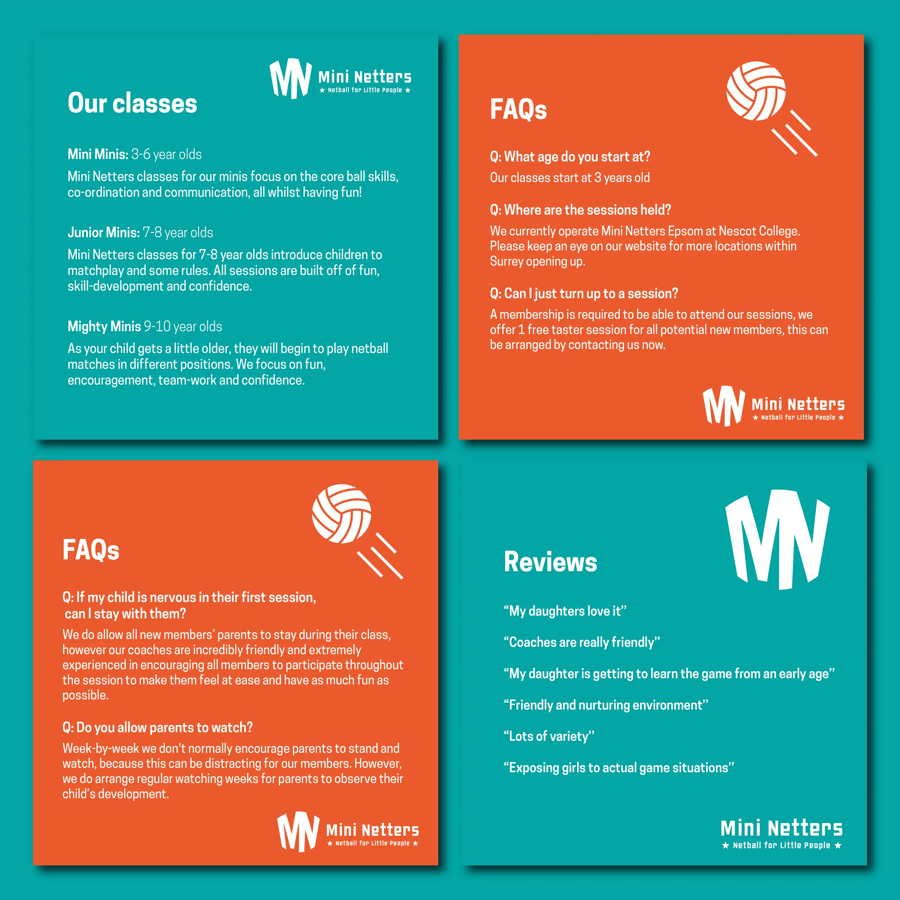
Mini Netters
“You’ve nailed it! I love it! I got the ‘ah-ha!’ moment!”
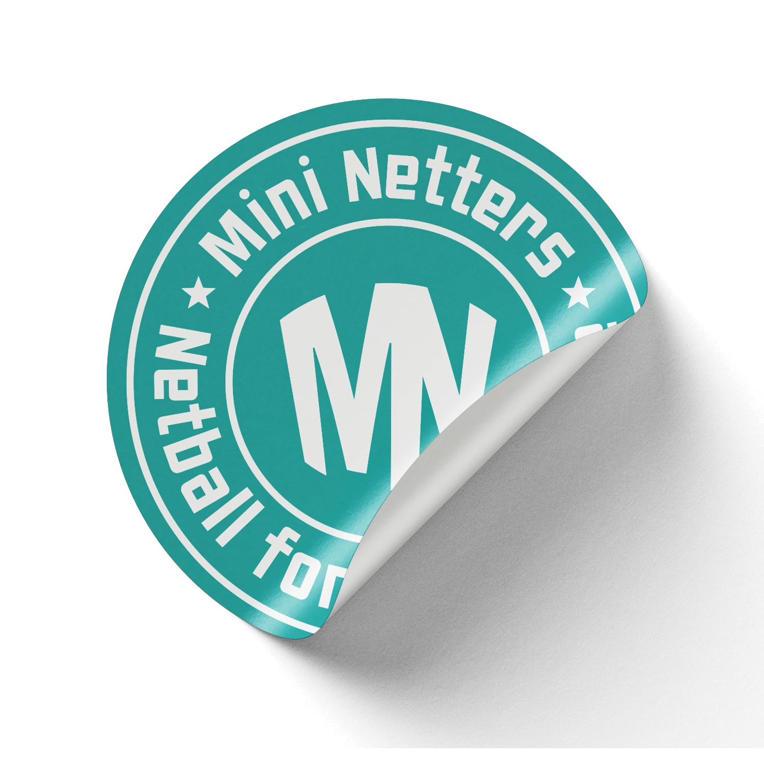
That was Laura’s reaction when she saw the new logo for Mini Netters, her children’s netball coaching business.
Laura approached SAWBO DESIGN Co. looking to breathe new life into her brand. The existing identity felt dated and lacked the spark needed to get kids excited about netball.
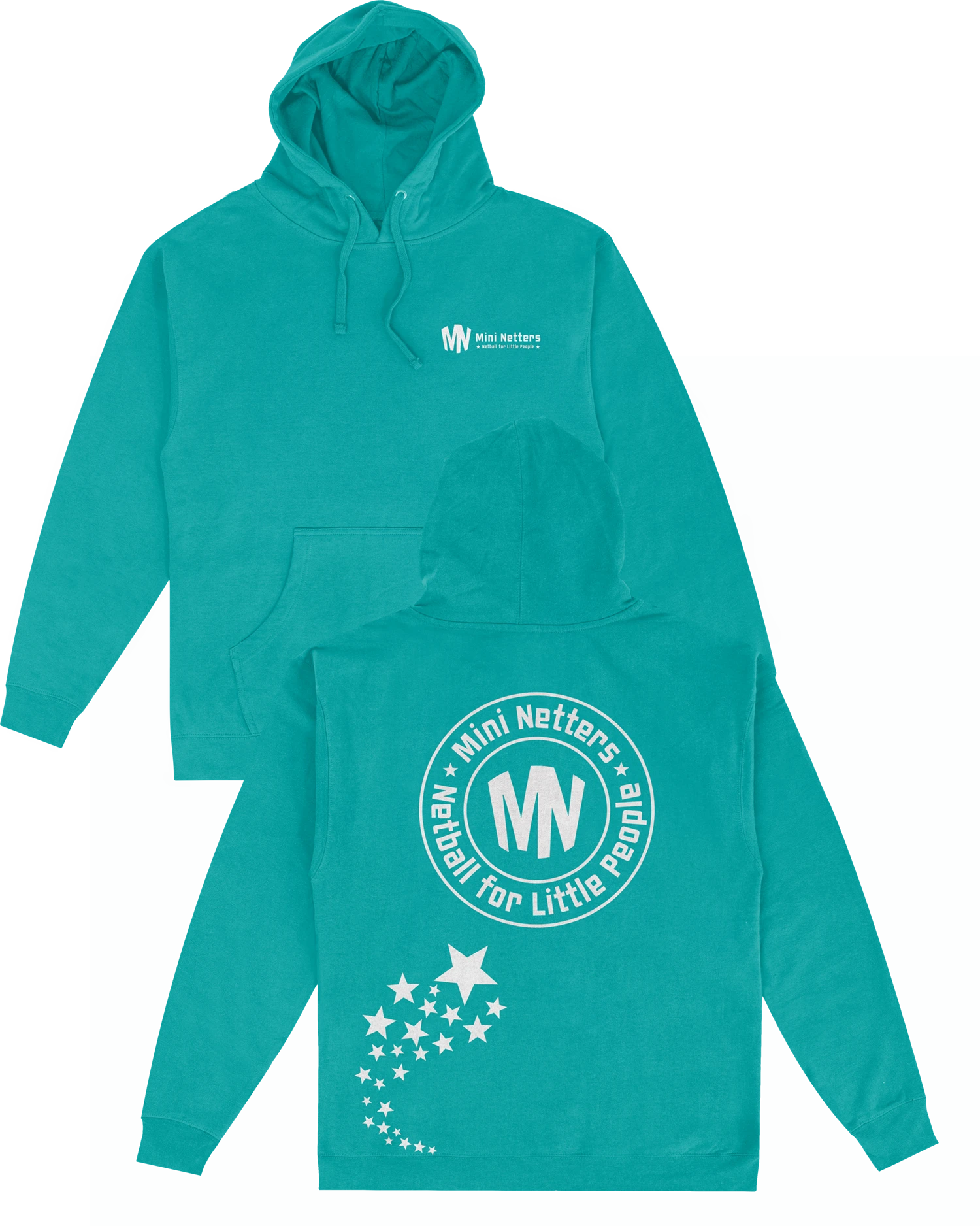
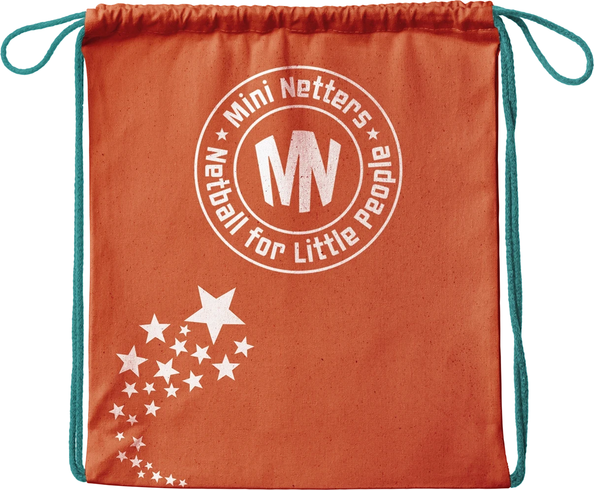
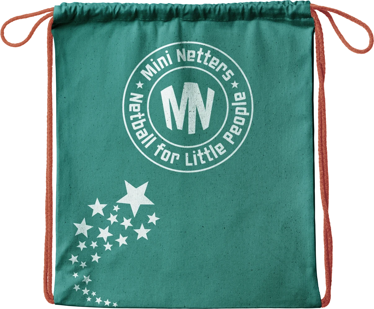
The solution? A vibrant, playful visual identity designed to inspire enthusiasm and encourage inclusivity:
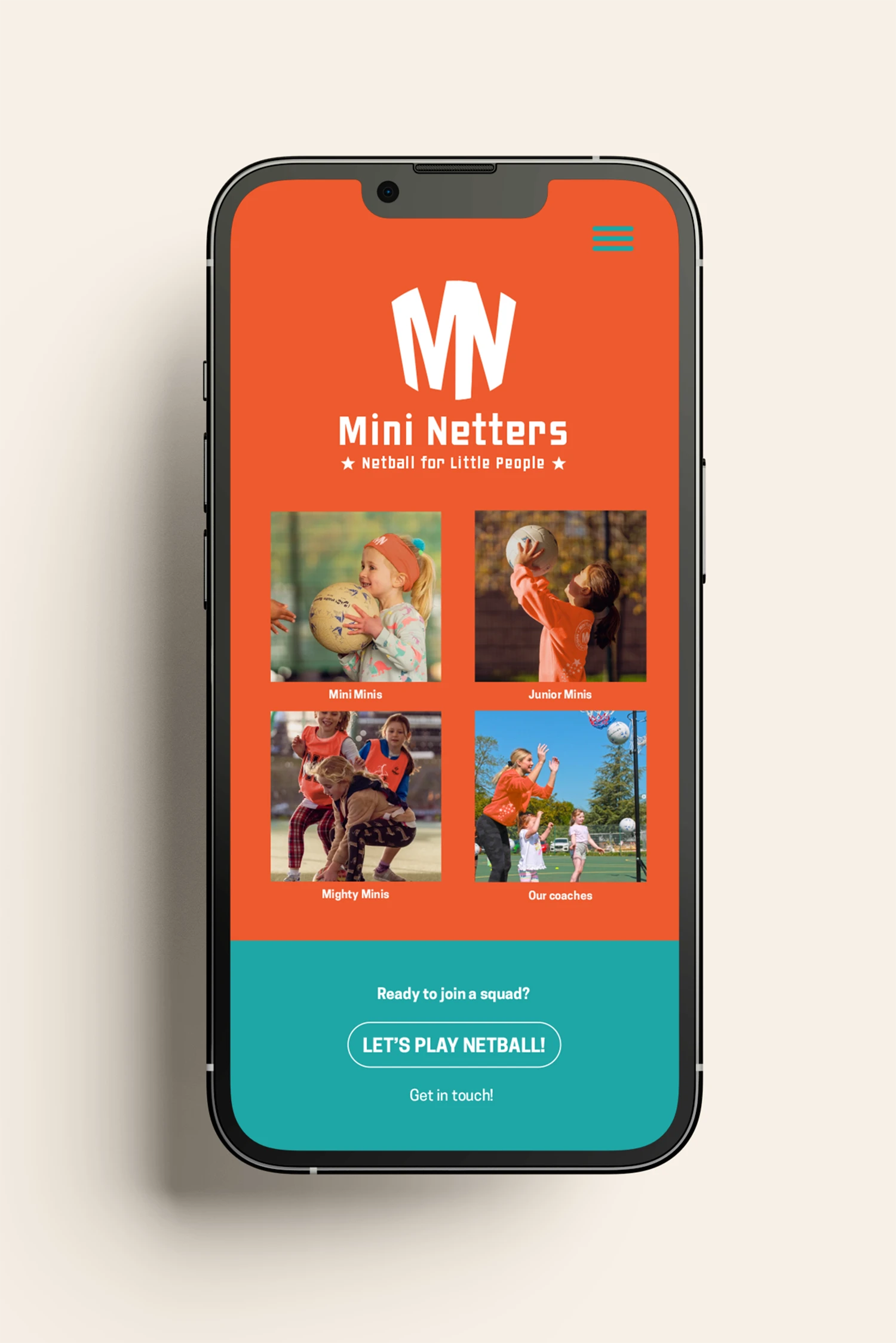
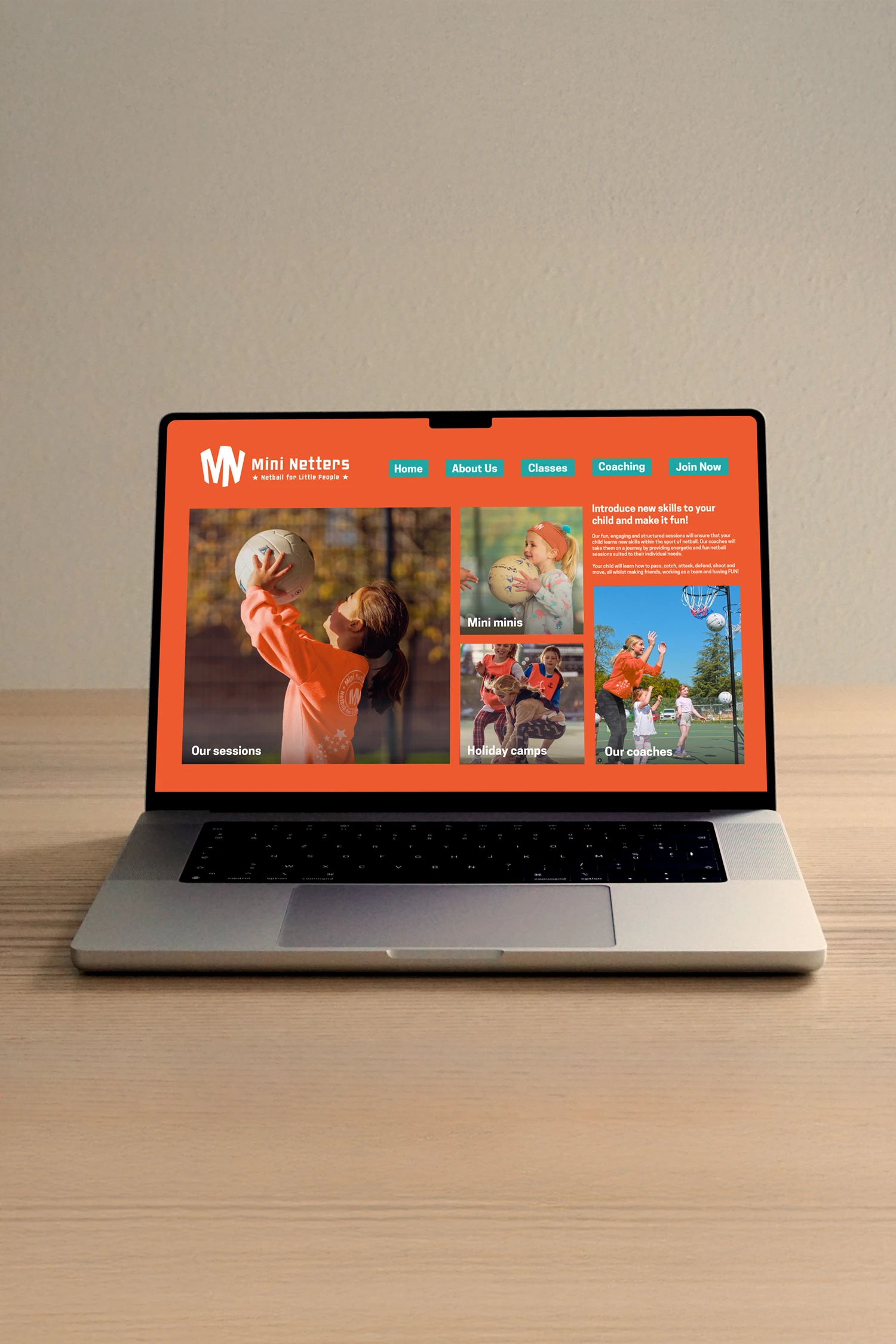
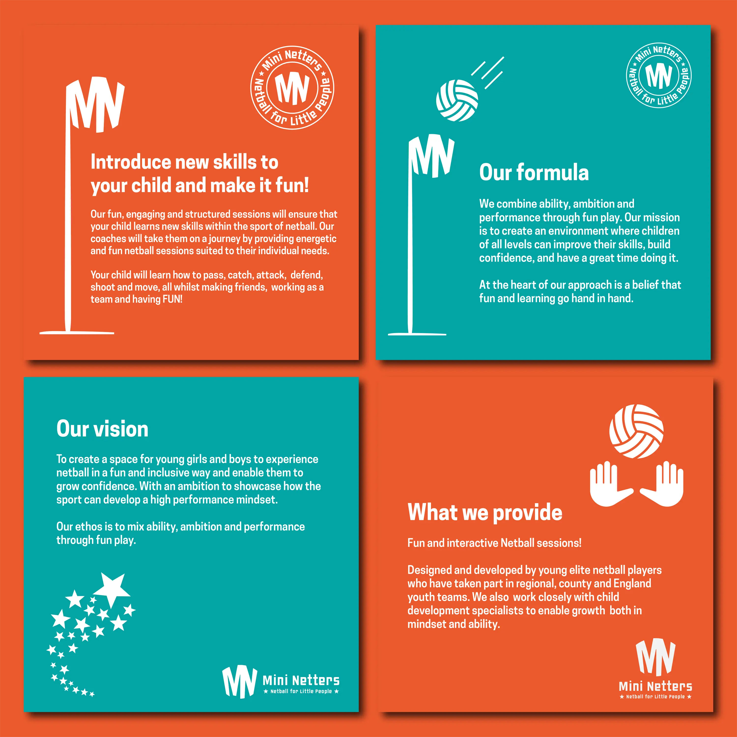
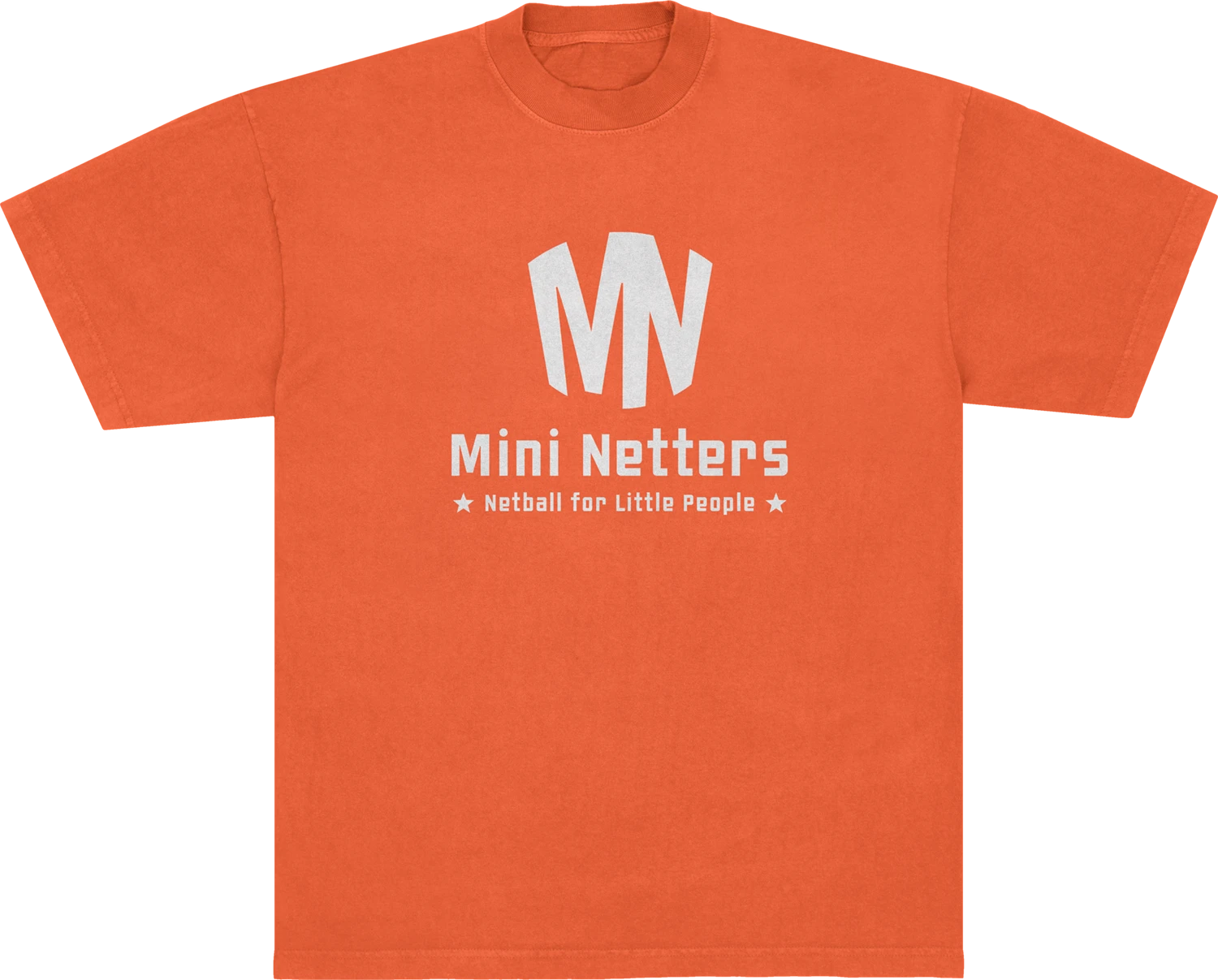
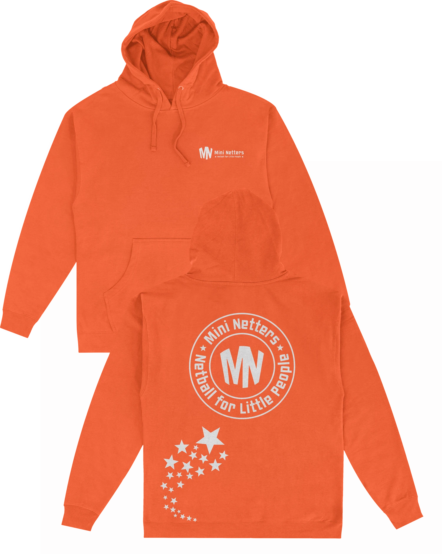
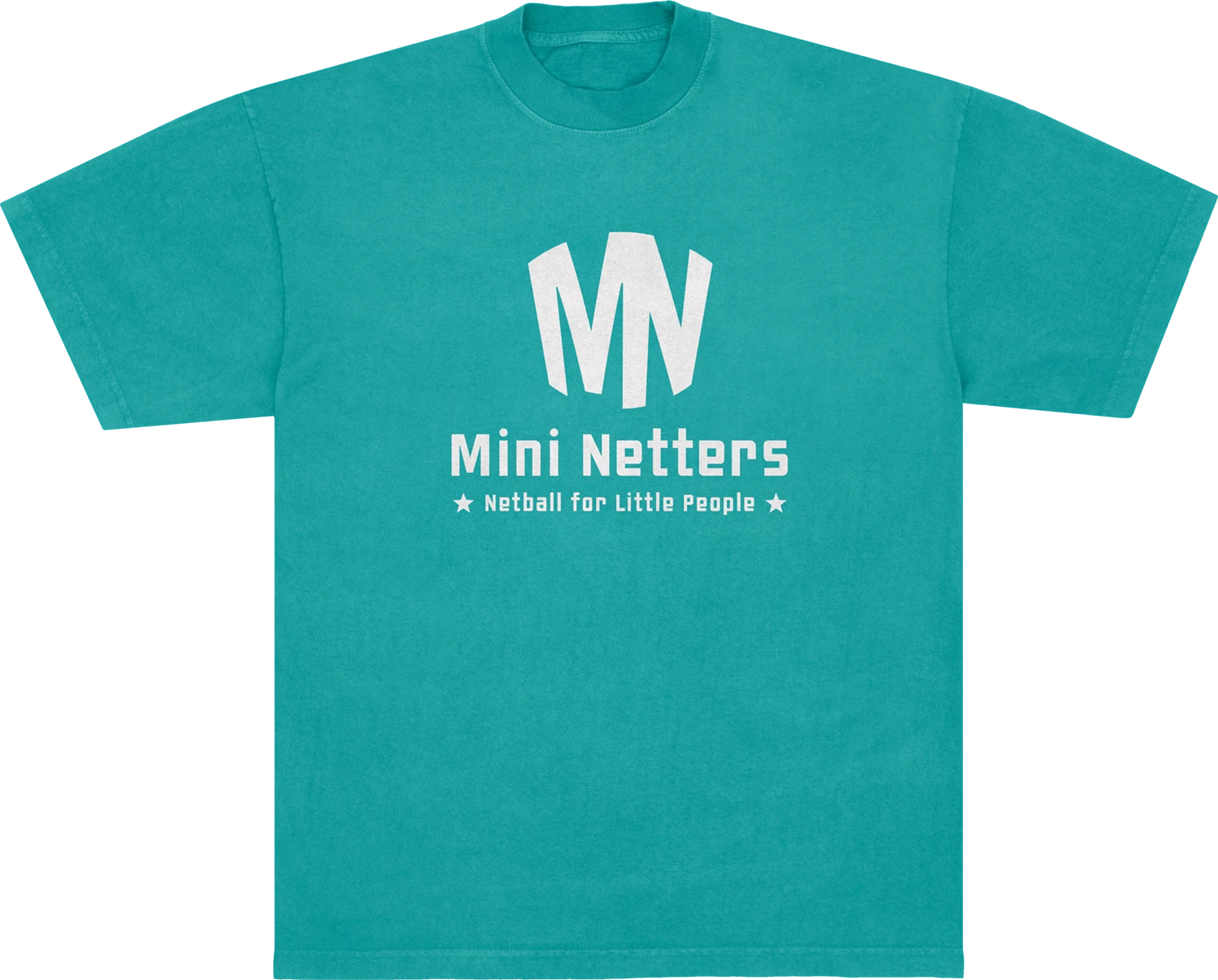
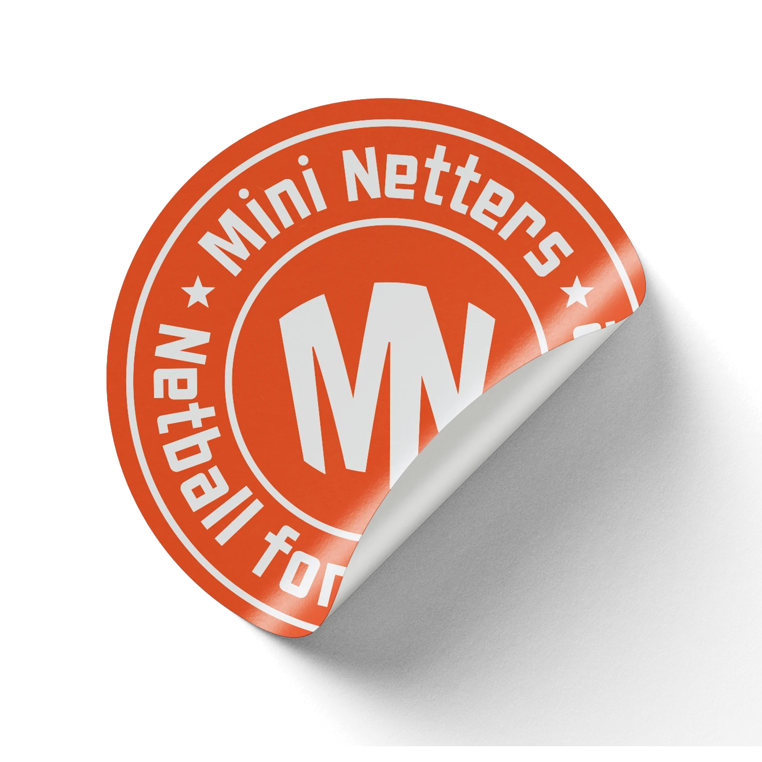
– The logo cleverly combines the initials MN with the shape of a netball hoop—creating that satisfying “ah-ha” moment when the hidden meaning clicks.
– A bright, gender-neutral palette of orange and teal brings energy and positivity to the brand, making it appealing and accessible to both boys and girls.
A flexible suite of logo variants and supporting assets rounds out the brand kit, giving Laura everything she needs to grow Mini Netters with confidence and consistency.
+
+
+
+
+
+
+
+
+